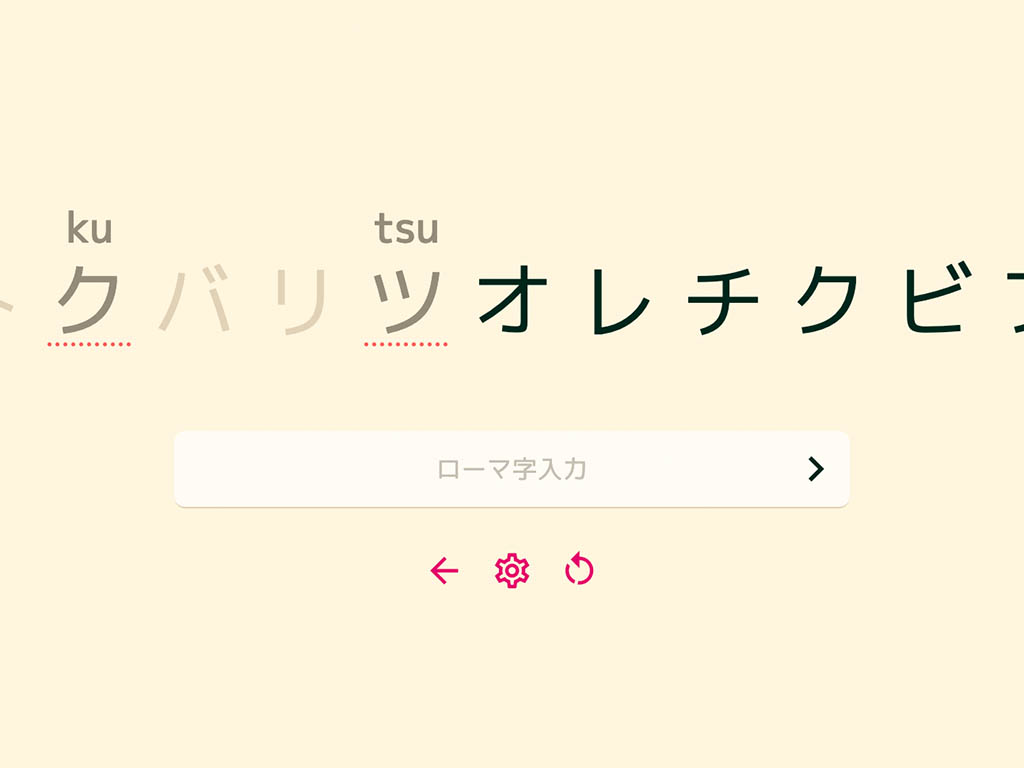
Type Kana is web app with a goal to help you learn to learn hiragana and katakana, the Japanese syllabaries.
Type Kana takes inspiration from its predecessors, Type Kana (will be referred to as “the original”) and Real Kana. While they both have their strengths, neither was perfect.
Type Kana aims to be the best way to study kana, by combining the best features from its predecessors, along with some fresh ideas. The end goal is to create a study experience that both functional and pretty, and built on the newest standards in web technology.
Study options
The first thing I immediately wanted to fix from the original Type Kana is to make it more friendly to beginners. The original tests you on the full set of katakana or hiragana at time. If, for example, you only know 50% of hiragana, then you’d get the wrong answer 50% of the time. This pushes “you messed up” feedback to the user frequently. This feels punishing to new learners. I strived to fix this by allowing the user to pick what they can study.
Something I struggled with was a good way to visually represent that you can select any kana for the quiz, but while also allowing the user to study both pairs in one session. After some brainstorming with a friend, we figured out an intuitive solution for this — When you have ‘both’ selected and select a kana, the katakana form first appears, and a short while later the hiragana form drops down on top. This communicates a good visual metaphor for what is being selected.
The quiz
Implementing the quiz itself was pretty straight forward. I started by inheriting the clever “typewriter” layout that the original Type Kana invented. I worked iteratively on this design until I arrived at something pretty and functional.
The quiz comes with some options to tailor your learning experience for you, one such feature allows you to retry failed answers. The feature is pretty simple — fail an item and it will appear later in the queue for review again. This was something that worked really nicely in RealKana, so I borrowed it.
Another option is the ability to automatically submit your answer without the need to press space. It comes in two flavors:
- Forgiving – Submit if answer is correct.
- Strict – Submit if answer is correct or wrong.
The logic for these cases is pretty fun:
function handleInput() {
  // get an array of valid answers
  // ["shi", "si"]
  const answers = getAnswers(currentKana);

  // $settings.autoCommit can have 3 different values:
  // "disabled" | "forgiving" | "strict"
  if (
    ($settings.autoCommit !== "disabled" &&
      isCorrectAnswer(input, currentKana)) ||
    ($settings.autoCommit === "strict" &&
      !answers.some((answer) => answer.startsWith(input)))
  ) {
    handleSubmit();
  }
}
In the hopefully not so distant future I would like to look into adding PWA support using Sapper (or whatever its replacement will be). This way you wouldn’t need an internet connection to be able to use Type Kana, and you could install it onto your phone.
You can check out the project and its source code at the links below.